Combination potted plant pairing tips to let you easily embrace a romantic spring
The world becomes colorful because of colors, and any color pairing has its techniques, especially in home decoration. For the choice of plants, colors must also be paired well so that the home can be more harmonious. Below, let us look at some principles of plant color pairing.
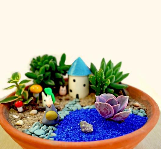
The color wheel is a very useful tool. Learning to use the color wheel can make complex color pairing problems relatively simple. In the color wheel, yellow, red, and blue cannot be mixed from other colors and are called the three primary colors. They are distributed at equal distances on the color wheel. Between them, also at equal distances, are orange, purple, and green, which are mixed from two primary colors and are called secondary colors (second colors, intermediate colors). When one primary color and one secondary color are mixed, a tertiary color is produced and placed between the two. The color wheel is composed of these 12 colors, and these colors in turn give rise to many colors due to differences in lightness and darkness, such as yellow becoming lemon when lighter and mustard when darker. Skillful use of the color wheel can create combinations with different rhythms of color.
1. Complementary colors
Complementary colors pair colors at opposite ends of the diameter on the color wheel, such as yellow and purple, or orange and blue. This kind of pairing can make each other's colors more vivid, produce a strong visual effect, and give people a bright and brilliant feeling. A common pairing of this kind is yellow French marigold or marigold with purple trailing petunia.
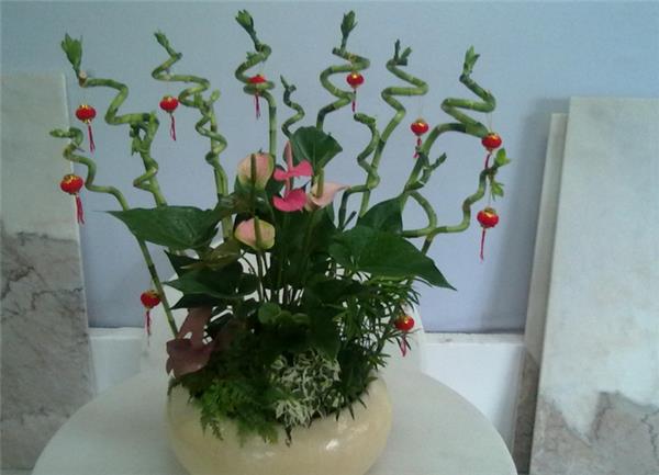
2. Analogous colors
Analogous colors are made by pairing adjacent colors on the color wheel, such as yellow-green, yellow, and yellow-orange, or blue, blue-purple, and purple. Analogous color pairings do not show dramatic color changes, have obvious unity, a quiet and peaceful atmosphere, and give people a harmonious and elegant feeling. They are mostly used for more solemn occasions.
3. Monochromatic
Monochromatic pairing takes one color and completes it with different degrees of lightness and darkness. This kind of pairing also has unity, a quiet and elegant atmosphere, and is very popular in Europe. This kind of pairing can often use a flower pot with strong contrast to enhance the effect, but if you want to express the monochromatic theme, it is best to use a flower pot with similar colors.
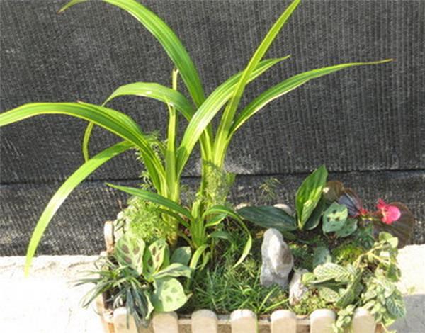
4. Warm colors
Colors such as red, yellow, and orange make people think of firelight, the sun, and red flags, giving a feeling of brightness, warmth, and passion, and they are often used for festive occasions. If you want your combination pot to be dazzling, warm colors are a very good choice, but be careful not to overdo it, otherwise it will become tacky. Warm color pairings can be matched with flower pots or containers in terracotta, light red, or copper-brown.
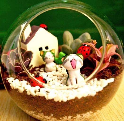
5. Cool colors
Blue, purple, and light pink belong to cool colors, and their pairing can create a quiet, cool, and elegant atmosphere. Because cool color pairings are relatively soft, they easily blend with the surrounding environment and are therefore widely used. Cool color pairings are suitable for planting in flower pots with natural colors, such as gray-white, gray-yellow, and bluestone color, and are also suitable for glazed flower pots, while being placed in terracotta pots is not unattractive either.
When considering how to match colors, you must first determine exactly what kind of color effect you want, then choose one color as the main color and use other colors for contrast and foil. Generally, using light colors as the main tone and dark colors as accompanying decoration gives a better effect. If light colors and dark colors each take up half, it will make people feel stiff and monotonous. When colors are uncoordinated, white placed between the two colors can increase the ornamental effect. It is not advisable to have too many colors in one combination pot; generally 2-3 kinds are appropriate. Too many colors will give people a feeling of disorder. At the same time, we should also consider that the colors of the combination pot coordinate with the colors of the surrounding environment (scenery).
The above is knowledge about plant color pairing. I hope it can help you.