A florist's growth is inseparable from color matching skills
Every florist, in the process of growing, goes through"lacking confidence in color matching - having their work revised - repeated practice forming color matching habits - breaking through and trying again"- and it is also in this process that we gradually build up our own aesthetic habits and color preferences.
Rich experience and bold judgment need to be cultivated through constant practice, whether you "succeed" on the first try or "take it apart and practice again."
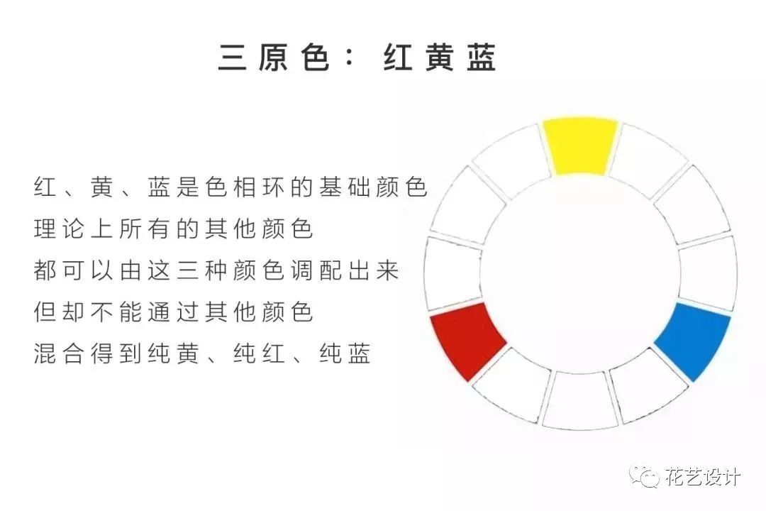
Today we will look at the color wheel and share with you the composition of the twelve-part color wheel and common color matching rules.
There are no two colors in the world that cannot be put together. To break out of plain color matching, you do not necessarily have to use novel floral materials; it is enough to start practicing with the floral materials you already have around you. Perhaps all we need is a different way of matching colors.
1 The composition of the twelve-part color wheel
2 Color matching rules
1. Adjacent colors/analogous colors
Adjacent colors are colors that sit next to each other on the color wheel, such as red, orange-red, orange, or blue-green, blue, blue-violet. For beginners, this is a very easy-to-use combination.
The effect of adjacent color matching lies in consistency; there is not much difference in hue, so it is easy for people to accept. This kind of matching can be used boldly without worrying about making a mistake.
Matching suggestions:
1. Keep all colors on the same color tone, that is, the colors chosen are either all high in brightness or all low in saturation, so that the resulting combination has consistency.
2. Choose one single hue and adjust only its brightness and purity to obtain another color, then match the two together.
2. Contrasting colors
Contrasting colors are a pair of colors positioned opposite each other on the color wheel. They belong to color combinations with a very strong visual impact. Common contrasting colors include: red + green, orange + blue, purple + yellow.
Matching suggestions:
1. When both colors are relatively high in saturation, they can be matched to create a stunning effect, because each color can perfectly bring out the characteristics of the other. The only thing to pay attention to is the proportion of area.
2. You can start by trying purple + yellow; this combination is a color scheme that people find relatively easy to accept.
3. Contrasting colors are usually also matched with harmonizing colors such as black, white and gray to soften them, making it easy for people's attention to be dispersed, so that it no longer feels a bit harsh on the eyes.
3. Equidistant triads
Three colors at equal distances from one another usually form a pleasing triad: the colors are relatively clear and highly recognizable.
Matching suggestions:
Combining floral materials with different brightness and saturation effects can make the colors as a whole more individual and create a colorful, lively feeling.
4. Split complementary colors
Split complementary colors means choosing one color from one end of the color wheel, then finding its contrasting color, and choosing the two colors adjacent to the contrasting color. Its essence is to use an analogous color to replace one of the contrasting colors.
Generally speaking, using split complementary colors can soften an overly strong contrast effect, produce more delicate color boundaries, and make it less likely for the colors to feel chaotic.
The adjacent colors, contrasting colors, equidistant triads and split complementary colors introduced above are the most common color matching methods. Using the concept of the color wheel for color matching is very convenient and conforms to our patterns of color perception. If you match colors according to these principles, you do not need to worry about making mistakes.
—— THE END ——
Image source for this article: Internet Text editing: fffloral
Everyone is welcome to leave comments or forward to Moments